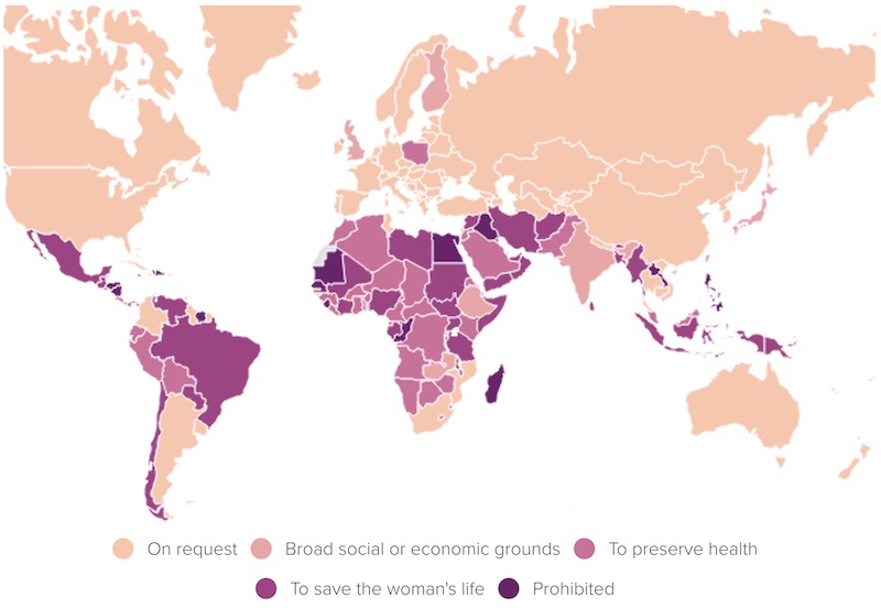
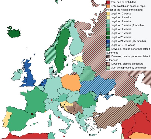
With abortion in flux in the US, I realized I didn’t have a clear picture of how things looked in the rest of the rich world. When I searched, I found lots of maps, like the following from Politico and Wikipedia:
 |
 |
These are helpful, but they’re very high level. If you read about individual countries, you’ll find that things are more complicated than these—or any—maps can convey.
I wanted to know: When is abortion available for what reasons? So I researched the policies in 27 countries, came up with a classification scheme, classified each week in each country, and then tried to visualize everything in a single graphic.
Here’s what I came up with:
The colors show “access scores” between 0 (no access for any reason) and 8 (available on-demand). Between those two extremes, there’s one point if abortion is allowed for each of the following reasons:
- The woman’s physical life/health
- Rape
- Incest
- Non-fatal fetal abnormalities
- The woman’s mental health
- The woman’s age
- The woman’s social condition, e.g. ability to care for a baby
The country/time regions are labeled by policy. If abortion is on-demand, there’s no label. Otherwise, r, i, f, and + indicate when various reasons are allowed, while L indicates the (rare) cases when abortion is not permitted to save the woman’s life.
I think this gives a richer picture, but it’s still missing a lot of nuance. Honestly, I’ve begun to doubt if a truly fair visual summary is even possible.
R&I – FS
Gellieman
Article URL : https://dynomight.net/abortion/?fbclid=IwAR1xv4qXchQVAHD6SicbAsku4pSmnHbWhCqwH0RO2yxNi7LFRRS3yWNX-oc
